Dos Toros App
Dos Toros is an east-coast based restaurant chain that's part of Founders Table Restaurant Group. They're dedicated to sharing our love and passion for the Bay Area Mission-style taqueria experience.
Year
2023 - 2024
Category
Food & Beverage
Type of Work
Customer Research
Branding
Product Design
Product Management
Problem: The Grubhub service that powered Dos Toros's old app was shutting down. Our old app was horribly outdated, with terrible UI. We were given 6 months to design and launch a new app.
Outcome: We overhauled the Dos Toros app experience in early 2024, delivering a vastly improved ordering navigation experience, new features like guest ordering, more marketing opportunities, and catering + regular ordering all in one platform.
For this project, I was the lead designer and product manager. I handled everything from conducting the competitive benchmarking, to designing the new menus, to managing the product launch from an operational / financial / tech perspective, and finally to crunching the post-launch statistics for our c-suite and investors.
This new app was a huge success. We saw: order-start-to-complete time drop by 5+ minutes, pickup average check increased by ~20%, app downloads increase 25% versus prior year, and Android Play Store rating improved from 3.67 to 4.34 stars after launch.
the old app
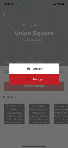
The old app was powered by LevelUp, a subsidiary of Grubhub that shut down in early 2024. The old app's gave an overall disjointed ordering experience: Menu design was bloated, with 10 different options for each bowl, burrito, taco depending on which protein you wanted (e.g. Chicken Burrito, Steak Burrito, Veggie burrito were all separate options). Each additional sauce and topping selection required multiple clicks to get into the drop down menu group. It was horribly painful.
There were no guest checkout options, so there is a barrier to ordering since customers had to sign up, and save a credit card before placing an order.
We sought to streamline that.
competitive research
Before we dove into app design, I conducted a mass competitive benchmarking both within and outside the food industry, to find the best-in-class customer experience. Our founders, c-suite team, and I visited 15 brands, and I compiled features we wanted in the future-state Dos Toros app.
Some examples:
For menu item customization, we wanted the 1-tap topping adjustment, and photos of the ingredients just like Sweetgreen. We liked Starbucks' clear out-of-stock UI. We also called out pitfalls to avoid, such as Souvla's "No XYZ topping" options, which becomes confusing to the customer between ingredient add-ons and removals.
For menu browsing, we wanted a clear, streamlined menu navigation Shake Shack, and didn't like Panera's long bloated menu list that becomes difficult to scroll.
For the homepage, we wanted to stick to the one component / one message clear design that Sweetgreen, Shake Shack, and Cava followed. Other brands like Panera or Tacoya bombarded the customer with deals and offers on the same screen, to the point where it dilutes the overall message.

app build
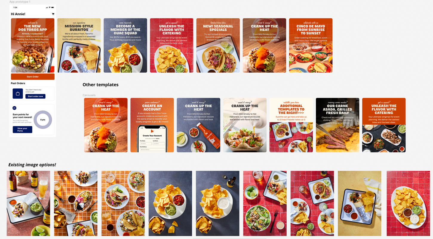
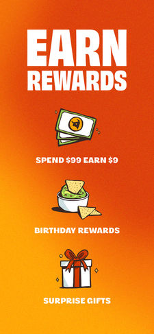
We partnered with Lunchbox, an app vendor, to provide the backend development framework of the app, but I entirely elevated our brand imagery, menu design, customer onboarding flows, and app marketing collateral.
To showcase one challenge we overcame: For restaurants, menu design is hugely important. From the customer perspective, our new menu had to be user friendly, and encourage higher average check.
I re-designed the digital menu flow to match the in-store experience: a customer choses the "type" of entree first (burrito, bowl, taco, salad), before needing to decide the fillings and add-ons. I also built the fillings to be completely mix and match-able, so you can get 3x Chicken and 2x Steak, for example, if you wanted to indulge.
This re-menu-ing has huge trickle down ramifications for the rest of our company, and this is where I flexed my Product Management and ex-consulting chops:
Technologically, I built new versions of the menu in Toast, our restaurant POS management system, to ensure the backend tech stack would still work when restaurant operators stocked out ingredients and forecasted inventory via our internal dashboards.
Operationally, I retrained 30+ restaurants operators on how this menu change would affect order fulfillment tickets in restaurant on the line, and the new system for queuing up orders at the cash register.
Financially, I made sure sales and product-mix reporting (aka the portions of chicken you sold) still worked under this new system, and we can easily map a "Chicken burrito" from our old 2023 sales, to a "Burrito with 2x Chicken" in our sales going forward. This is hugely important for how tracking order conversions and performance indicators improve after the app launch.
Design-wise, re-menuing also meant coordinating new photos of all our menu items and toppings to show on the digital app and website.
All to say, designing for the best customer experience isn't easy, but it's worth it.

the new app
The new app launched in April of 2024 and it was a huge success, and I'll highlight some of my favorite outcomes:
With my menu re-design, we saw order-start-to-complete time drop by 5+ minutes, pickup average check increased by ~20%. Customers are getting through the ordering flow faster, because we cut the # of taps to create items and add to cart. With the photos of our sides of chips and desserts, premium toppings, drinks, more customers were adding these to their orders, increasing overall check.
We launched guest ordering, and it was hugely loved by new customers. Without a mandatory sign-up, the barrier to entry for placing an order on our app significantly decreased. While our loyalty customers remained consistent, we saw a great 4%+ profitability bump from these guests who still ordered frequently, but didn't use loyalty rewards.
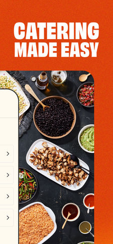
I encouraged our team to put catering and regular ordering on the same app, and this enabled huge cross-sales. In the 2 months following launch, this alone drove ~1% of the sales lift, with 90+ catering
customers placing 260+ regular loyalty orders, that each have almost 200% higher average check size than average regular customers.
The new app was significantly more captivating than our old app, with colorful, photos of our seasonal specials on the homepage and more interactive elements. We saw app downloads increase 25% versus prior year, and Android Play Store rating improved from 3.67 to 4.34 stars after launch.


